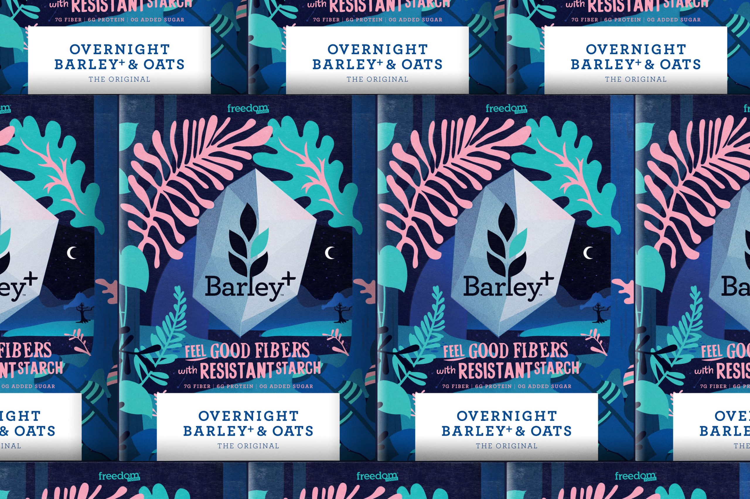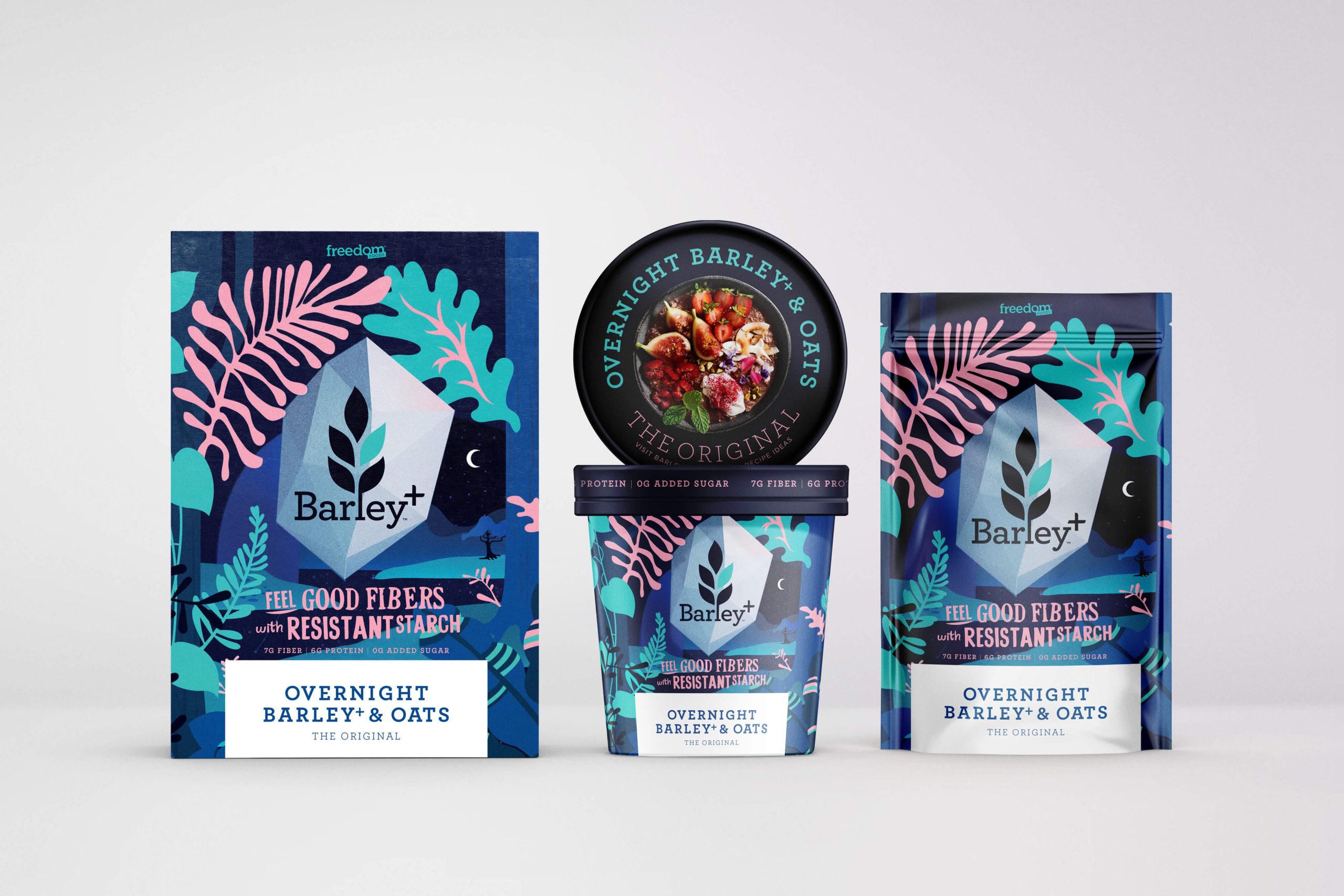
CONNECTING Barley+ Oats / Porridge to the customer and consumer lifestyle.
SERVICES
CREATIVE DIRECTION
PRODUCT POSITIONING
PACKAGING
COPYWRITING
Barley+ wanted to launch their overnight oats into the US, a challenging, multi segmented space with multiple state boundaries. They’d identified their consumer and starting point but were needed packaging that did a lot of the heavy lifting.
Our challenge was to connect to the customer and consumer – alongside perceived perception of judgement by the outside world. We knew that the target was leaning towards a female 30-40 working mum who was looking for on-the-go functional solutions (that looked good). This target aspired to the US farmers market, but time could be a challenge.
We needed a packaging design that would connect on-shelf, help explain the product and appeal aesthetically to the consumer lifestyle. We knew the market had matured enough to accept unexpected at shelf and so created something that challenged perceptions.
Our key design motivators were personality / standout, confidence and active / feel good developing into a progressive design that maximises accessible personality, feel good ease, and a striking look.

WORK CLUB, 201 KENT ST, SYDNEY NSW 2000